# https://stackoverflow.com/questions/71522196/how-to-customize-a-dumbbell-plot-in-r
library(ggplot2)
library(dplyr)
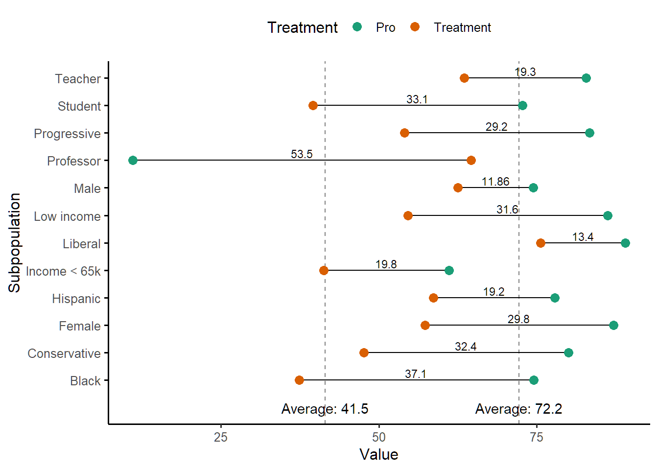
Subpopulation <- c("Female", "Female", "Male", "Male", "Low income","Low income", "Income < 65k", "Income < 65k",
"Student", "Student", "Teacher", "Teacher", "Professor", "Professor", "Black", "Black",
"Hispanic", "Hispanic", "Conservative", "Conservative", "Liberal",
"Liberal", "Progressive", "Progressive")
Treatment <- c("Treatment", "Pro", "Treatment", "Pro", "Treatment", "Pro", "Treatment", "Pro", "Treatment", "Pro", "Treatment", "Pro", "Treatment", "Pro",
"Treatment", "Pro", "Treatment", "Pro", "Treatment", "Pro", "Treatment", "Pro", "Treatment", "Pro")
Value <- c("57.3", "87.1", "62.54", "74.4", "54.6", "86.2", "41.3", "61.1", "39.6", "72.7", "63.5", "82.8",
"64.6", "11.1", "37.4", "74.5", "58.6", "77.8", "47.6", "80", "75.6", "89", "54.1", "83.3")
mydf <- data.frame(Subpopulation, Treatment, Value) ##data
mydf$Value <- as.numeric(mydf$Value)
mydf %>%
group_by(Subpopulation) %>%
mutate(Difference = Value - lead(Value),
Position = Value - (0.5 * Difference)) %>%
ggplot(aes(x = Value, y = Subpopulation)) +
geom_vline(xintercept = c(41.5, 72.2),
lty = 2, alpha = 0.5) +
annotate(geom = "text",
x = c(41.5),
y = "",
label = "Average: 41.5") +
annotate(geom = "text",
x = c(72.2),
y = "",
label = "Average: 72.2") +
coord_cartesian(clip = "off") +
geom_line(aes(group = Subpopulation)) +
geom_point(aes(color = Treatment), size=3) +
geom_text(aes(label = abs(Difference),
y = Subpopulation,
x = Position),
nudge_y = 0.25, size = 3) +
theme_classic(base_size = 12) +
theme(legend.position = "top") +
scale_color_brewer(palette = "Dark2") +
theme(axis.ticks.y = element_line(colour = c("transparent",
rep("black", 12))))